Next-generation graphics are reshaping televised baseball by turning every pitch, swing, route, and managerial decision into information viewers can grasp in seconds. In baseball broadcasting, graphics means the on-screen visual layer that sits above live video: scorebugs, pitch tracking, player identifiers, defensive positioning maps, replay telestration, probability models, and augmented reality elements rendered to match the field. The digital age has expanded that layer from basic inning and count data to real-time analytics pipelines connected to optical tracking systems, radar hardware, cloud production tools, and second-screen distribution. For networks, clubs, streaming platforms, and rights holders, this matters because baseball is a detail-rich sport with long decision chains. The better a broadcast explains those details, the more clearly casual fans follow the action and committed fans stay engaged through all nine innings.
I have worked on sports content plans where the difference between a forgettable telecast and a compelling one came down to whether the graphics team answered the viewer’s next question before it was asked. Why did the catcher set up outside? How unusual was that launch angle? Why did the shortstop start in shallow right? Strong baseball graphics answer those questions instantly and accurately. They also support the wider media ecosystem around the game. A televised moment now lives simultaneously on linear TV, league apps, streaming platforms, social clips, team sites, and connected TV interfaces. A hub page about broadcasting and media in the digital age must therefore cover not only what appears on screen, but also the data sources, production workflows, audience expectations, monetization pressures, and editorial standards that shape modern baseball coverage.
This article explains how next-generation graphics enhance the televised baseball experience, why they have become central to baseball media strategy, and which related topics define the broader broadcasting landscape. It covers tracking technology, storytelling design, streaming integration, accessibility, advertising, production operations, and future developments. As a hub for broadcasting and media in the digital age, it also establishes the core questions that every supporting article should answer: how data is collected, how it is visualized, how it affects fan understanding, and where the technology creates tradeoffs. The central point is straightforward. When graphics are built around clarity, context, and credible data, they make baseball easier to understand without flattening its complexity.
The technology stack behind modern baseball graphics
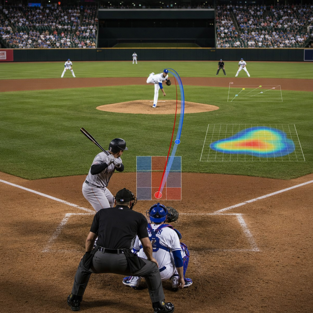
Today’s baseball broadcast graphics are powered by a layered technology stack that combines capture, processing, rendering, and distribution. The foundation is tracking data. Major League Baseball’s Statcast era introduced a standard expectation that pitch velocity, spin rate, exit velocity, sprint speed, route efficiency, catch probability, and defensive positioning can appear on screen within moments. Those metrics depend on synchronized systems that include high-speed cameras, optical tracking, radar, and calibrated field coordinates. Production teams then pass that data through graphics engines from vendors such as Vizrt, Chyron, Ross Video, and Unreal-based augmented reality workflows, depending on the network and show design.
The practical challenge is latency. A graphic is only useful if it appears quickly enough to support the play. In live production, the truck or control room needs trusted feeds from official league data providers, internal stats teams, replay operators, and graphics producers who can verify outliers before they go live. If a pitch briefly reads at an implausible velocity because of a tracking glitch, the credibility of the whole telecast suffers. That is why elite broadcasts build validation rules into their pipelines and rely on dedicated operators who understand baseball context, not just software operation. The best systems combine automation with editorial judgment.
Cloud production has also changed the economics of baseball media. Regional sports networks, national broadcasters, and streaming platforms increasingly use remote integration models in which some graphics staff work from centralized production hubs rather than every stadium. This lowers travel costs and allows more consistent visual packages across a season. At the same time, it requires robust connectivity, synchronized timing, and failover planning. Baseball’s schedule is relentless, so graphics systems must be scalable and resilient. One missed feed during a Sunday night showcase is visible to millions.
How graphics improve understanding of the game
Baseball is often described as a slow sport, but from a broadcast perspective it is a fast information sport. The pitch is over in a fraction of a second, and the meaning of the result depends on count leverage, batter tendencies, defensive alignment, pitch sequencing, park dimensions, and game state. Next-generation graphics improve understanding by compressing those layers into intuitive visual explanations. A strike zone box alone is not enough anymore. Viewers benefit from overlays that show pitch movement relative to the intended target, heat maps of previous pitch locations, and before-and-after comparisons that explain why a hitter was fooled.
Good graphics also help newer fans decode strategy without making expert fans feel patronized. For example, a simple visual of infield positioning before the pitch can explain a pull-heavy hitter’s tendency and prepare the audience for why a ground ball became an out. Catch probability and route graphics can show that a spectacular out was not just dramatic but genuinely difficult. Win probability can frame the leverage of a late at-bat, though it should be used carefully and not as a substitute for narrative. The strongest broadcasts treat analytics as a tool for explanation, not decoration.
Clarity depends on design discipline. Fonts must remain readable on large televisions and mobile screens. Color choices must preserve contrast and avoid confusing team branding with data categories. Animation should guide the eye rather than distract from live action. In my experience, producers who ask one question before every graphic insertion produce better telecasts: what does the viewer know after seeing this that they did not know before? If the answer is vague, the graphic probably does not belong on air.
Core graphic types and what they add to a telecast
Different graphic categories serve different editorial jobs, and the most effective baseball broadcasts balance them throughout the game.
| Graphic type | Primary purpose | Baseball example | Viewer benefit |
|---|---|---|---|
| Scorebug | Track game state | Inning, count, outs, runners, pitch count | Instant orientation on every pitch |
| Pitch tracking | Explain pitch quality | Velocity, spin, break, location, release point | Shows why a pitch missed bats or induced contact |
| Batted-ball analysis | Describe contact | Exit velocity, launch angle, projected distance | Separates loud outs from weak hits |
| Defensive positioning | Visualize alignment | Shift depth, outfielder starting spots | Connects pre-pitch strategy to result |
| Probability models | Measure situation | Catch probability, win probability | Adds context to leverage and difficulty |
| Augmented reality | Create spatial explanation | Strike zone reconstruction or basepath overlay | Makes complex geometry easy to see |
Scorebugs remain the most important element because they are always present. A weak scorebug damages every inning; a strong one quietly improves every inning. Networks have learned that baseball viewers want count, outs, baserunners, pitcher workload, and often batter stats without clutter. From there, specialized graphics can appear situationally. During a pitching duel, sequencing graphics matter more. During a power surge, batted-ball visuals become more useful. During a replay-heavy defensive game, route and positioning graphics carry more weight. The mix should follow the editorial shape of the game.
Augmented reality deserves special attention because it is often overused. When done well, AR can show wall height, home run trajectory, or a defender’s path in a way 2D overlays cannot. Fox and other major broadcasters have used field-anchored graphics to illustrate dimensions and matchup data with cinematic polish. But AR succeeds only when registration is precise and the visual metaphor is simple. If the viewer notices the effect more than the information, the production has chosen spectacle over comprehension.
Streaming, second screens, and platform-specific storytelling
Televised baseball no longer means one feed for one screen. A single game may have a traditional national broadcast, a team-centric stream, a data-rich alternate telecast, condensed highlights in an app, and near-live clips distributed across social platforms. Next-generation graphics must therefore be modular. A lower-third designed for a sixty-inch television may fail on a phone, while a mobile-first vertical highlight may need larger text, fewer variables, and tighter timing. Smart broadcasters build graphic systems that can adapt across aspect ratios, bandwidth conditions, and audience intent.
This is where digital-age media strategy becomes inseparable from broadcast design. Streaming audiences often expect personalization. They want selectable audio, integrated stats panels, betting-related context where regulations allow, and companion experiences that can be toggled on or off. Amazon, Apple, ESPN, and regional streaming products have all pushed the industry toward interface-aware baseball presentation. The telecast is no longer a fixed canvas. It is a flexible product layer that can serve a traditional viewer, a fantasy player, a data enthusiast, or a casual fan arriving through a clip.
Second-screen behavior also changes how graphics should be written. Because viewers frequently divide attention between the game and a phone, the best on-screen stats are concise and self-explanatory. Dense abbreviations that once worked for scorebook-heavy audiences can now create friction. Plain-language labels such as hard-hit rate or swing-and-miss percentage often outperform jargon when used on general-audience broadcasts. That does not mean oversimplifying. It means translating specialist concepts into broadcast-ready language without losing accuracy.
Editorial standards, accessibility, and trust
Baseball graphics influence what viewers believe about players and decisions, so editorial standards matter. Networks should identify the source of advanced metrics, define uncommon terms when first used, and avoid presenting probabilistic models as certainty. A catch probability graphic, for example, measures estimated difficulty based on historical plays with similar inputs; it does not tell the full story of wind, wall familiarity, or first-step hesitation. Responsible broadcasts use these numbers as informed context rather than verdicts. That distinction builds trust over a long season.
Accessibility is just as important. Color-blind-safe palettes, legible typography, consistent icon systems, and closed-caption compatibility all improve the baseball viewing experience. Audio description and clear announcer integration help viewers who may not process a complex visual quickly. The goal is not merely to add data, but to make data understandable. This is especially relevant in baseball because every half inning resets the situation. Repetition with consistency helps viewers reenter the telecast smoothly after interruptions, ads, or divided attention.
Trust also depends on restraint. More data does not always create a better broadcast. I have seen productions bury a key moment under too many simultaneous numbers, causing viewers to miss the emotion of the play. The director, producer, analyst, and graphics team must coordinate so the visual layer supports the human story. Baseball remains a game of anticipation, tension, and release. Graphics should sharpen that rhythm, not smother it.
Business impact and the future of baseball media coverage
Next-generation graphics are not only editorial tools; they are business assets. Better graphics increase watch time by reducing confusion and making lulls feel meaningful. They create sponsorship inventory around data moments, replay features, and branded segments. They also strengthen the identity of a network or streaming product. Viewers may not name a graphics package explicitly, but they notice when a baseball broadcast feels modern, coherent, and easy to follow. In a fragmented rights market, that perception matters.
Looking ahead, the most important developments will likely center on personalization, automation, and deeper integration between live production and interactive media. Machine learning can help surface relevant matchup notes in real time, though human producers still need final editorial control. Volumetric capture and more precise field mapping may improve immersive replay and AR placement. Localized streams could present different statistical emphases for different audiences, from beginner-friendly feeds to analyst-led broadcasts with denser visual context. At the same time, privacy, gambling regulation, and data rights will continue shaping what can be shown and how aggressively it can be commercialized.
For anyone covering innovations and changes in baseball, broadcasting and media in the digital age is a foundational subject because it determines how fans actually experience the sport. The headline lesson is clear: next-generation graphics work best when they translate complex baseball information into fast, trustworthy, visually disciplined storytelling. They help viewers understand strategy, appreciate skill, and stay connected across television, streaming, apps, and clips. As this subtopic hub expands, explore the linked themes beneath it: tracking technology, alternate broadcasts, streaming distribution, regional sports network change, accessibility standards, monetization models, and fan engagement design. Follow those threads, and the modern baseball media landscape becomes much easier to read.
Frequently Asked Questions
What are next-generation graphics in televised baseball?
Next-generation graphics are the advanced visual tools layered over a live baseball broadcast to help viewers understand the game faster and more clearly. Rather than showing only a basic scorebug with the inning, count, and score, modern broadcasts now add pitch tracking, player IDs, exit velocity, defensive alignment maps, baserunner speed, probability models, replay telestration, and augmented reality elements that appear to sit naturally on the field. These graphics translate complex baseball data into visuals that can be understood in seconds, even during a fast-moving at-bat or key defensive play.
What makes them “next-generation” is not just the amount of information, but how intelligently that information is presented. Broadcasters can now tie live camera feeds to real-time data systems, allowing graphics to update instantly as the ball leaves the pitcher’s hand, crosses the plate, or is put into play. Instead of asking viewers to interpret raw numbers on their own, the production presents context: where a pitch missed, how unusual a defensive shift is, what the likely outcome of a stolen base attempt might be, or how a hitter performs against a specific pitch type in a specific count. The result is a richer, more intuitive viewing experience that serves both dedicated fans and casual audiences.
How do advanced graphics improve the baseball viewing experience for fans at home?
Advanced graphics improve the at-home experience by making baseball’s subtle decisions visible. Baseball is full of small adjustments that can be easy to miss on a standard television feed: a catcher setting up on the outside corner, an infielder shading toward the pull side, an outfielder taking an unusually deep starting position, or a pitcher changing attack patterns from one at-bat to the next. Next-generation graphics highlight those choices in real time, helping viewers understand not just what happened, but why it happened.
They also make the pace of the game feel more engaging. During natural pauses between pitches, broadcasts can use visual overlays to explain pitch movement, compare arsenals, show swing paths, or display matchup tendencies without interrupting the flow of the action. When used well, these tools add clarity rather than clutter. A fan can quickly see that a fastball had exceptional ride, that a hitter crushed a ball at a high exit velocity but directly at a defender, or that a manager’s bullpen move is supported by strong lefty-righty matchup data. That combination of speed, context, and visual storytelling helps transform baseball from a game viewers passively watch into one they actively read and interpret.
What types of baseball graphics are most valuable during a live broadcast?
The most valuable baseball graphics are the ones that immediately add context to the live action. Pitch tracking is among the most important because it shows where the ball crossed the plate, how much it moved, and how a pitcher is attacking a hitter. Defensive positioning graphics are also highly useful, especially when they reveal how a team is aligning against a particular batter and whether that positioning influenced the result of a ball in play. Replay telestration remains essential because it helps analysts break down mechanics, timing, routes, tags, and decision-making in a way that standard replays often cannot.
Probability-based graphics can also be extremely effective when used carefully. Win probability, catch probability, hit probability, and stolen base success projections can provide immediate perspective on how difficult a play was or how much a moment changed the game. In addition, player identification graphics, matchup splits, basepath speed visuals, and augmented reality strike zones all contribute when they are timed properly. The key is usefulness, not novelty. The best graphics answer a viewer’s question before the viewer even asks it, providing the right information at the precise moment it matters most.
Do next-generation graphics make baseball broadcasts too complicated?
Not when they are designed and deployed correctly. In fact, the best next-generation graphics do the opposite of making a broadcast more complicated: they simplify complexity. Baseball is a deeply strategic sport with layers of information that can be difficult to explain through commentary alone. A clean visual showing pitch location patterns, defensive depth, or likely base-stealing outcomes can clarify a concept far more effectively than a long verbal explanation. Good graphics reduce confusion by turning abstract data into instantly readable visuals.
That said, there is a real difference between informative graphics and overloaded screens. If a broadcast places too many numbers, animations, and labels on-screen at once, viewers can become distracted from the game itself. Effective production teams avoid that problem by prioritizing hierarchy, timing, and readability. They know when to keep the screen simple, when to introduce a deeper data layer, and when to pull back. The goal is not to impress viewers with technology for its own sake, but to support the story of the game. When that balance is right, advanced graphics make broadcasts more accessible for newer fans while giving experienced fans more insight to enjoy.
How are augmented reality and real-time data shaping the future of baseball broadcasting?
Augmented reality and real-time data are pushing baseball broadcasting toward a more immersive and interactive future. Augmented reality allows networks to place virtual graphics directly onto the field or around players in a way that appears anchored to the live environment. That can include strike zone visuals, defensive positioning markers, baserunning lanes, player comparison towers, or animated pitch paths that match the camera angle. When these elements are rendered accurately, they make television coverage feel more spatial and easier to follow, especially for viewers trying to understand positioning, movement, and decision-making.
Real-time data is equally important because it powers the speed and relevance of those visuals. Tracking systems can now capture pitch shape, bat speed, launch angle, sprint speed, and fielder routes almost instantly, allowing broadcasters to explain key moments while they are still fresh. Over time, this capability may lead to increasingly personalized viewing experiences, where different audiences see different data layers depending on their preferences. Casual fans might prefer cleaner, story-driven overlays, while advanced fans might want deeper tactical details. Together, augmented reality and real-time data are turning baseball broadcasts into smarter, more dynamic experiences that preserve the drama of live sports while making the game easier to understand at every level.